TELUS Support Centre Redesign - Web
Role: Lead Product Designer, Research, User Testing, Prototyping, Wireframing
Collaborators: Harrisson Joseph (Co-lead Product Designer, Research, User Testing, Prototyping)
Jaime Bishara (User Researcher), Ece Dilege (User Research), Ravika Singh (Content Lead), Rebecca Harper (Information Architecture), Freddy Ramirez (Developer) & Luis Farfan (Developer), Oskar Westin (Accessibility Lead)
The Support and Help Centre on TELUS.com houses over 2000 articles and guides for every TELUS product and service. The goal of the Support Centre is to allow users to self-serve and easily triage to find relevant information for their troubleshooting needs. This would allow users to solve problems on their own without the need to contact customer service, alleviating friction and aligning with TELUS business goals to reduce customer service calls.
The Problem
Due to an increase in customer service calls we sent out a survey to customers who had recently leveraged the Support Centre to better understand their pain points. Through the results of the survey we learned that customers struggled to find relevant information and would often leave the site to call customer service. 31% of users found the Support navigation experience confusing and felt they weren’t able to locate what they were looking for.
Goals / KPIs
-

Reduce call-in rates
by creating an accessible and intuitive self-serve customer journey with the goal of getting customers to relevant solutions.
-

Increase engagement
and click-through rates on Support hub. Previous data shows that once customers reach an article page they are much less likely to call customer service.
-

Increase log in rates
by enhancing the authenticated experience through personalization and communicating the benefits of logging in.
The Research - Phase 1
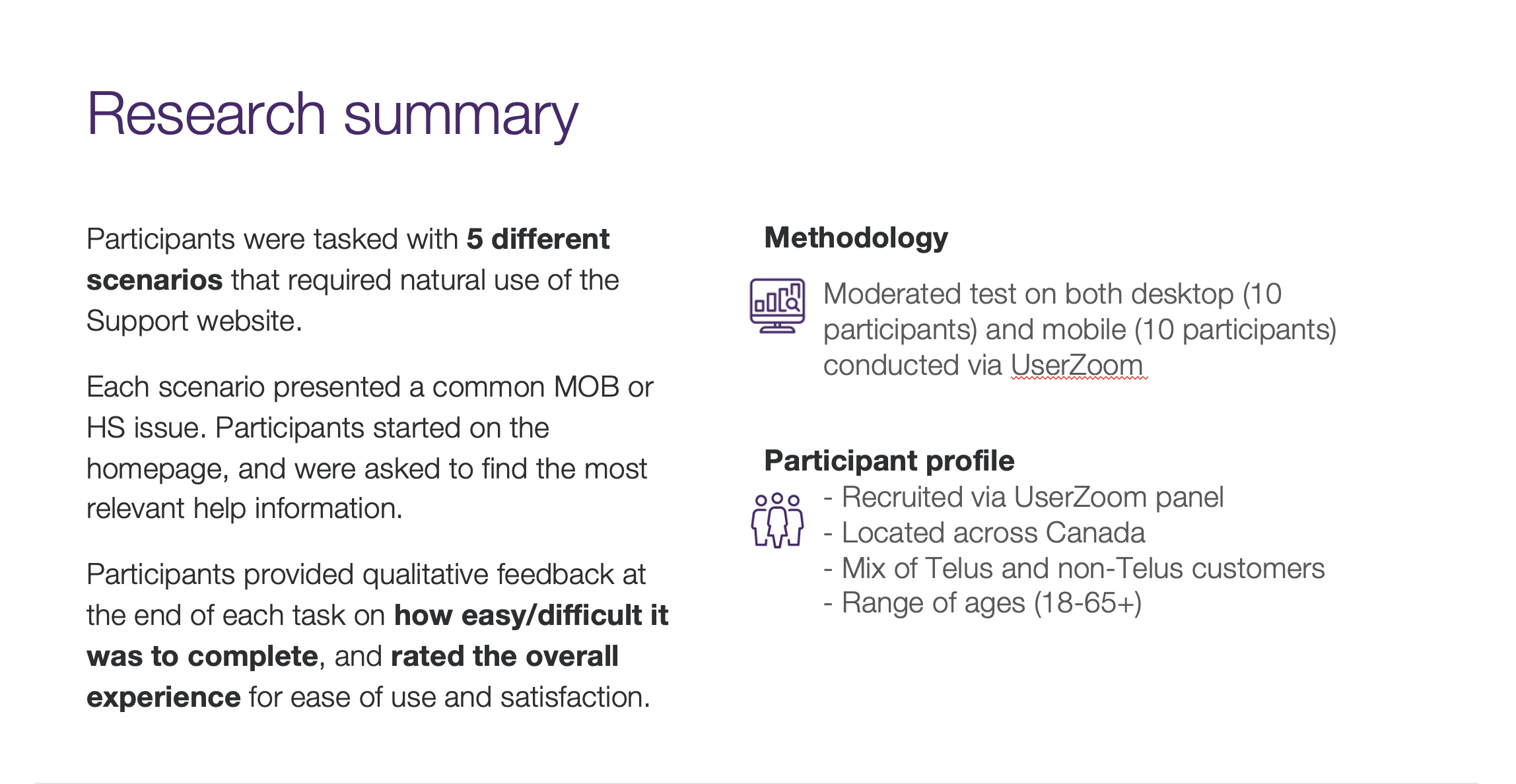
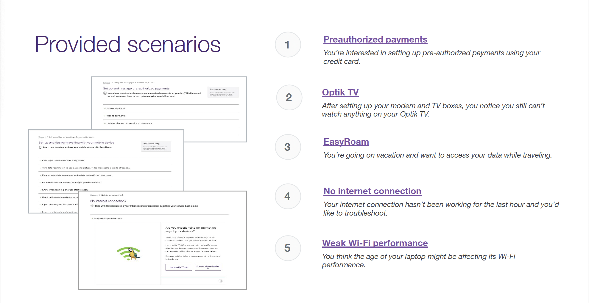
Now that we knew customers were having a difficult time triaging to relevant content, we needed to find out where in the experience were users clicking on, where they were getting stuck, and which areas were causing issues. To answer these questions, we decided to do run moderated Usability Testing to identify areas of improvement in the current live user journey.
Working together with the UX Research department I helped put together a research plan, user questions / scenarios, acted as observation notetaker when the tests were under way and helped synthesize the data results after the tests had completed.
Findings - Phase 1
As we watched participants navigate through the Support site, we saw them encounter several different roadblocks that prevented them from accomplishing their goals. A notable outcome was that even when participants eventually managed to get to an article page, they didn’t always reach the correct one needed for the task, and didn’t realize it. In a real world scenario, this is something that would eventually cause frustration when the user can’t find what they need.
Here were our main findings:
-

The Search bar
was a lifeline to people with 80% of participants engaging with it
-

70% experienced a loop
or getting lost and navigated back and forth between pages
-

Information overload
and unclear categories left participants uncertain where to click next
-

Unnecessary entry points
clogged up the journey and gave users too many opportunities to go off track
-

Login walls
created barriers to articles and left users confused when they needed to sign in
-

Regional lockouts
derailed a few users from accessing information and distracted them
-
Banners linked off Support
and brought participants to marketing pages instead
-

Notification banners
were useful or distracting depending on what topic the user was looking for
Old Support Centre Experience:
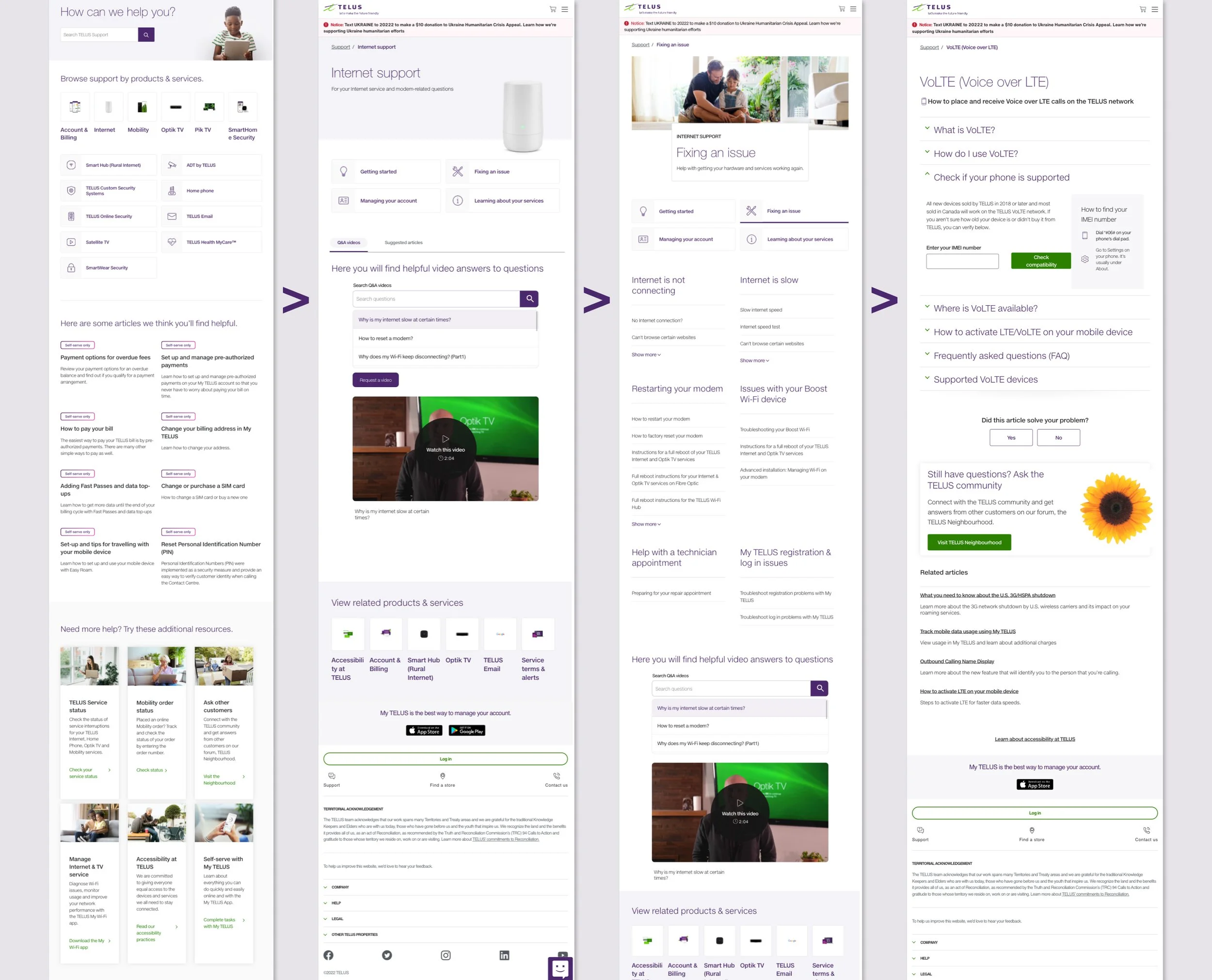
The Support Centre is made up of four fundamental pages: The Homepage, Product pages, Intent pages and finally, an Article page. The intention of each page is to narrow down the user’s specific needs by going through a linear filtering system, ultimately leading to the article page that should contain relevant information for the customer. However, unnecessary features got added in over time that caused bloat and distracted users from the straightforward triage path they were meant to follow.
Our testing showed that participants barely interacted with areas such as the “Helpful Articles”, “Additional Resources” and “Related Products and Services”. Those who did ended up in circles when the categories weren’t pertinent to what they were searching for. Participants would scroll up and down the page looking for the most relevant entry-point to find information. They often weren’t confident which section or block would lead them to the right content.
Additionally, when users did travel the “correct” triage path, they found that the category titles were unclear and left them with a sense of uncertainty that often led to aimless clicking and guessing with a hope that what they pressed on would be the accurate option. These were the main pain points we aimed to address with our updated user flow.
Information Architecture Testing
Through our initial test, users had challenges locating proper information and relied heavily on key words and category headlines to guide them in the right direction. They often found the wording unclear, repetitive and unintuitive which led them to feel uncertain in their choices.
With this data in mind, we knew we had to streamline our information architecture, improve the discoverability of content and consolidate similar categories / articles. To help with updating our taxonomy, we engaged with our Information Architecture specialist to train us in running Card Sorting tests and Tree Testing to better understand how users think and group Support topics.
Benchmark Tree Testing
Before we could start updating our site’s hierarchy, we needed to measure user performance and satisfaction with current site structure to compare future iterations of the tree structure to identify any improvements. To do this, we created a text-only version of the site’s hierarchy and laid it out in front of participants with specific prompts. Participants were then asked to highlight a category or page within that structure where they would expect to find a particular item or piece of content. In a successful tree test, the goal is to reach 65% - 80% task success rates.
The initial benchmark success rates came back quite low. For instance, our initial results using the current Internet tree showed there was a lot of room for improvement, with only one task scoring 65% and a majority of the tasks scoring 18% or lower.
Card Sorting
After our initial benchmark testing, we we conducted a card sorting study to understand how participants categorized and grouped Support topics. Participants were tasked with sorting Support article titles into categories that made sense to them, providing insight on their mental model and expectations.
The card sort informed:
● Information organization: identified how participants naturally organized information, which served as the initial foundation of the tree structure.
● Content groupings: revealed common patterns and groupings generated by participants.
● Labeling and terminology: validated if the terminology used for category labels resonated with participants or if they caused confusion.
After this study was completed, the Support team completed a card sort of our own for each product, importing every article title and utilizing the feedback from our user study to generate new categories to test.
Updated Tree Testing
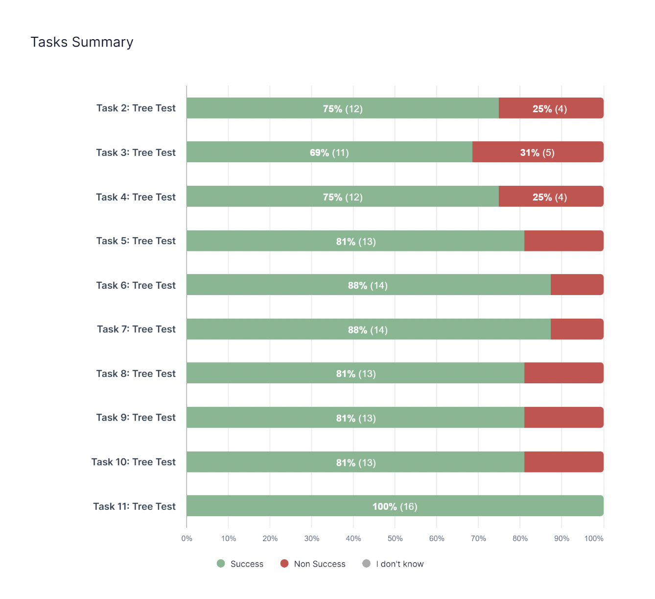
Newly created categories in hand, we set up new tree tests with identical tasks from the Benchmark test. Once the tests were completed, we would quickly iterate the tree in areas where we saw users expecting topics to be under other categories.
For Internet, we tested 13 iterations of a new navigation structure before we got to 69%-100% task success rates. The navigation that resulted in these high success rates became our new Internet taxonomy.
Updated Designs and Prototypes:
Based on the learnings from our Usability Testing, and the updated taxonomies from Tree Testing, we worked on a prototype that addressed our KPIs and pain points:
Removed unecessary and distracting features such as the “Helpful Articles”, “Additional Resources” and “Related Products and Services” sections to make an easy and clear entry point for users. This also had the added benefit of reducing scroll, which was much needed especially on mobile pages.
Updated the products and services to give them the same amount of hierarchy so users can skim to find their relevant product quicker. Previously they were separated in design by how popular the product / service was using click through rate as the metric. We still organized the product categories by most used to least used, but aligned them to be one cohesive section. On mobile we shortened the long product scroll by adding a “Show More” dropdown after the Top 4 products.
Streamlined and customized navigations with the new tested taxonomies per product and service. Where there had been boiler plate templates, such as the category headers “Getting Started, Fixing an Issue, Managing Your Account, and Learning About Your Services” now had its own unique categories that related specifically to that product. For instance, Television categories were updated to be more specific: “Digital boxes, remotes and other hardware, Audio and picture optimization, Initial setup and installation, TV viewing options and channels management, Automated TV repair tools, Recordings management, Service transfers, suspensions and moves.”
Reduced the amount of pages and clicks users needed to do to triage through by combining the Product and Intent pages into one microsite that appeared as one page and interaction on the front-end.
Created a “Results Hub” page after the Product page triage to house all relevant topic articles, tools, videos, guided flows etc. all in one accessible place so users could choose their mode of troubleshooting. Our studies showed that people appreciated having different methods of learning information, and previously these tools had been spread out across different pages.
Added the Search bar to each page of the journey for users to use as a lifeline if needed, when previously it was only accessible on the Homepage.
Added a prompt to log in on Support Homepage.
Added personalization to authenticated states by updating the Homepage headline to read the users name, “Hi, [Username}, how can we help?” Additionally, when logged in, we wanted to surface products the customer specifically had, as well as dynamic article / tool recommendations based on common queries with the products. This is something we designed for, but ultimately had tech limitations that delayed integration. It was still a pivital feature we really wanted to integrate and was still being explored by the time I left.
Created rules around the use of the Notification banners to only be used when something urgent needs to be communicated. The purpose of this component was never meant to be ever green, and instead to inform users of temporary interruptions. I created Figma guidelines with the different component variables and how to use them, including different states (urgent, warning etc) and copy counts. Previously Notification banners were overly long and on mobile actually completely eclipsed the Homepage unless you scrolled, leaving users to believe this was the only way to troubleshoot.
Devs and management looked into resolving blockers such as random login prompts and regional lockouts on the backend, as well as worked with stakeholders to not put marketing messages in article page banners.
The Research - Phase 2
Once we had our completed prototype, we needed to validate the changes we made to make sure they were actually usable. We reused the test setup from our original Usability Test with our new design to see if participants found it easier to discover the appropriate content. This test was run by Ece Dilege.
Findings - Phase 2
Participants generally had a positive experience navigating and triaging their issues. Many participants were able to quickly find the relevant information and navigate through the interface with ease and were able to triage their issues effectively.
Looking at the data, we saw a sizeable increase in participants who were able to find the correct information. Average ease of finding information was 4.25 out of 5, up from the 3.4 out of 5 we recorded in the original test. Participants also rated the ease of navigating the Support site much higher than our Phase 1 test.
Areas of friction were mainly in relation to category dissonance, with certain category titles not resonating with users. We knew that the category organization would be an ongoing initiative, and were able to use this feedback to tweak content and also take closer inspection on categories that continued to be pain points even after updates, such as “Easy Roam”, in order to re-evaluate how we approached them.
Integration and Results
With the promising outcomes of our second phase Usability Testing, we were finally ready to launch the new navigation flow and gather real-time data on its performance. We saw great results that aligned with the goals / KPIs we were hoping to achieve with this initiative. Here are some statistics from the first month live:
-

28% call decrease
in customers who clicked call or callback without trying a Support option
-

155% engagement increase
where at least one Support option was explored
-

152% log in increase
after at least one option on the Support Centre was engaged with
Before and After
This project was truly a team effort, and I’m so thankful for the knowledgeable experts I got to work with on this complex problem in order to untangle the large amount of dense information we were working with. There was a lot of thinking on our feet, pivoting, agility and passion that went into this.
Through this process we were able to understand our customers and their needs better. We collected over 100 pages of research and data through many tests that only helped us continue to improve our users’ experiences. We learned that customers want to self-discover solutions and we wanted to empower them to do so.
Support is an ever growing being that covers every subject TELUS has to offer. Previously it had just been a hub to place information without too much thought on how that information was presented. We knew going into this that there would never be one permanent solution, but instead that we needed to put into place strategies that allowed it to be continually cared for - not unlike that of a TELUS critter in fact. We wanted to think future forward and build the skills needed to continually upkeep and iterate as more content got added, while also optimizing the content we already had. I believe we accomplished this and am incredibly proud of what we were able to achieve!
Next steps included continual categorization improvements and article page enhancements.


