Audiobooks Masterlist Webpage Redesign
Role: Lead Designer, UI / Prototyping, User Testing
Collaborators: Sam Arnold (Design, User Testing)
Natasha Granja (Copywriting), Jacques Viau (Copywriting)
The Audiobook Masterlist page is a landing page on Kobo.com that customers go to to find their next listen. It would continually come through Creative to be updated with new lists. The way it was configured the lists would just be added to the bottom of the page, creating an endless scroll and a difficult user experience. Recognizing this as a core landing page on the site with dual purpose for SEO and conversion, I identified that this would be a prime candidate for redesign and iteration, knowing that it will remain evergreen, and that there will be a continued need to update it.
Original Design
The original design of the webpage was made up of categories that would lead viewers to specified audiobook lists based on the category they clicked on. When new categories needed to be added to the page, they would be tacked onto the bottom. On mobile, the page spanned 12,159 pixels in length and had 53 lists to choose from. I took a mobile first approach to the update, knowing that at least 50% of people use their mobile device to browse online, and that the length of the page on mobile needed to be addressed.
Heatmap
To support the hypothesis that viewers were dropping off the page without clicking on something or scrolling to the bottom, we set up a heat map to gather statistics of how customers were actually interacting with the page versus our assumptions. Here are the results:
-

80% of people
who reach the page drop off without clicking on anything
-

Of the people
who stayed on the page, most did not scroll past the first 2-4 lists
-

Of the few people
who clicked on something, it was the header or the first 2 lists
-

0% of people
made it to the bottom
of the page
Prototypes
Based on these learnings, I created 2 initial working prototypes in mobile first that addressed:
The length of the page - both designs used solutions to make the page as short as possible
The length of the header and header copy - We made the header much shorter and brought content up above the fold
Category organization - Identified categories to organize the content into for ease of browsing and retaining SEO
Additional lists - Designed pages in a way that allowed for additional content to be added as needed
Below are the 2 prototypes that have different approaches to information organization. They are interactive, so feel free to scroll, click or go through the slides. There is also a Restart button at the bottom right to be brought back to the starting state.
User Testing
Once the usable prototypes were created, we formulated a usability testing plan in collaboration with UX. We had 6 participants to assist as test subjects. The goal was to validate the experience of the new layouts by contrasting the two prototypes. We had the following success criteria:
Users are able to navigate the prototypes to browse through categories of curated audiobooks
Users can carry out specific tasks and locate a curated list
Users show an understanding of the content of the page as they interact with the experience
Once the user has interacted with both experiences, they’re able to contrast what they enjoyed and/or found challenging with both experiences
The results:
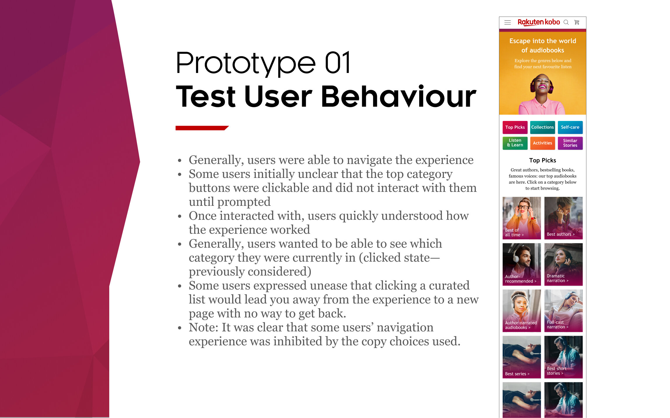
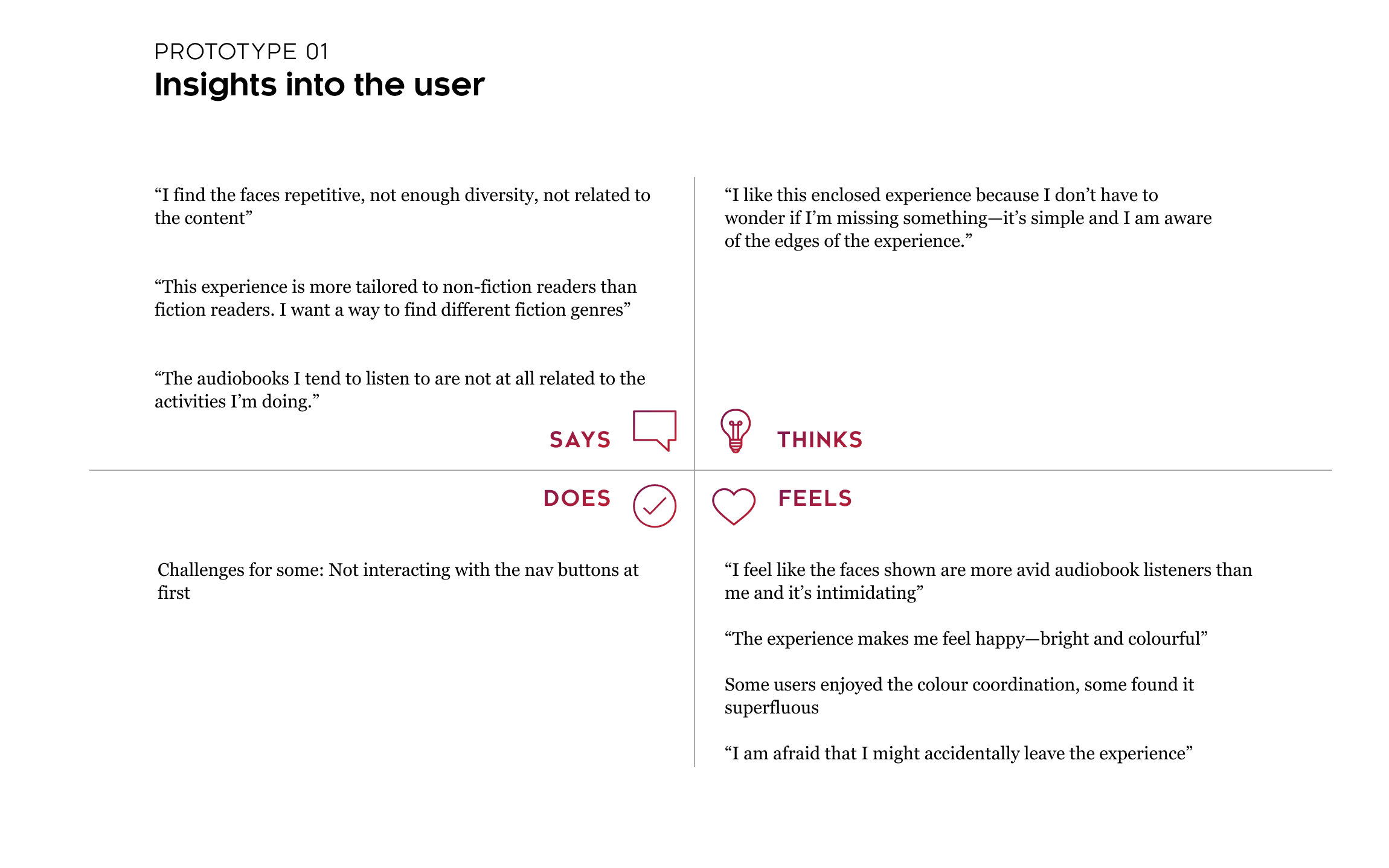
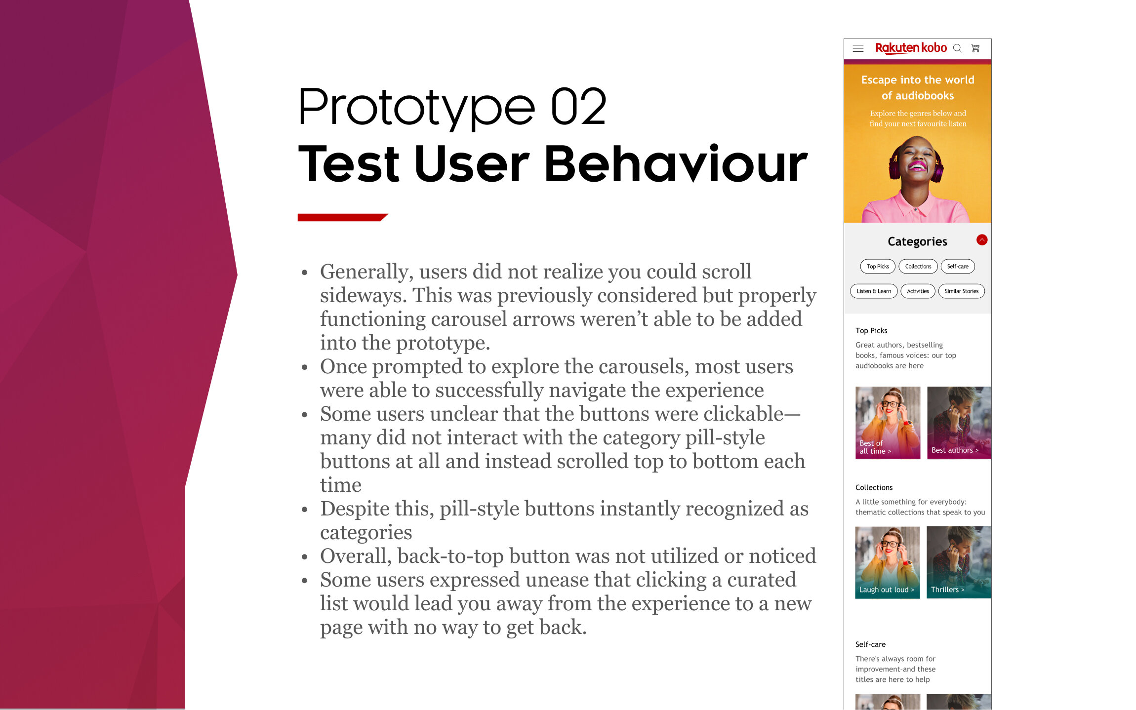
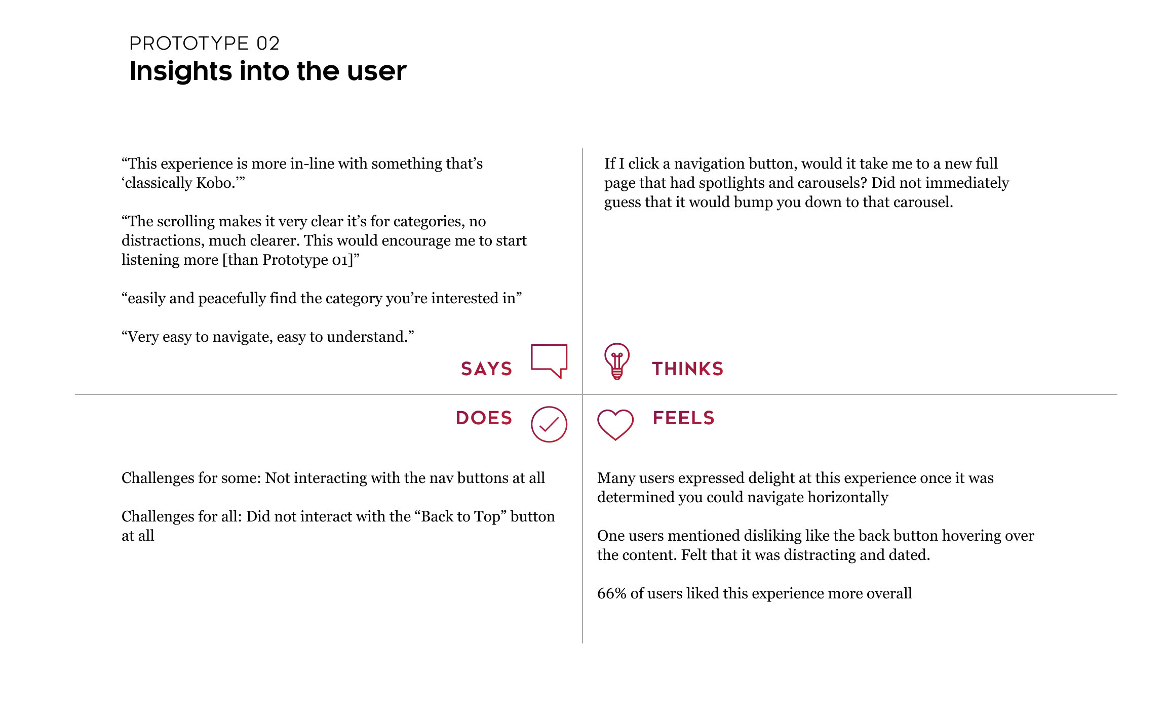

Category Reorganization
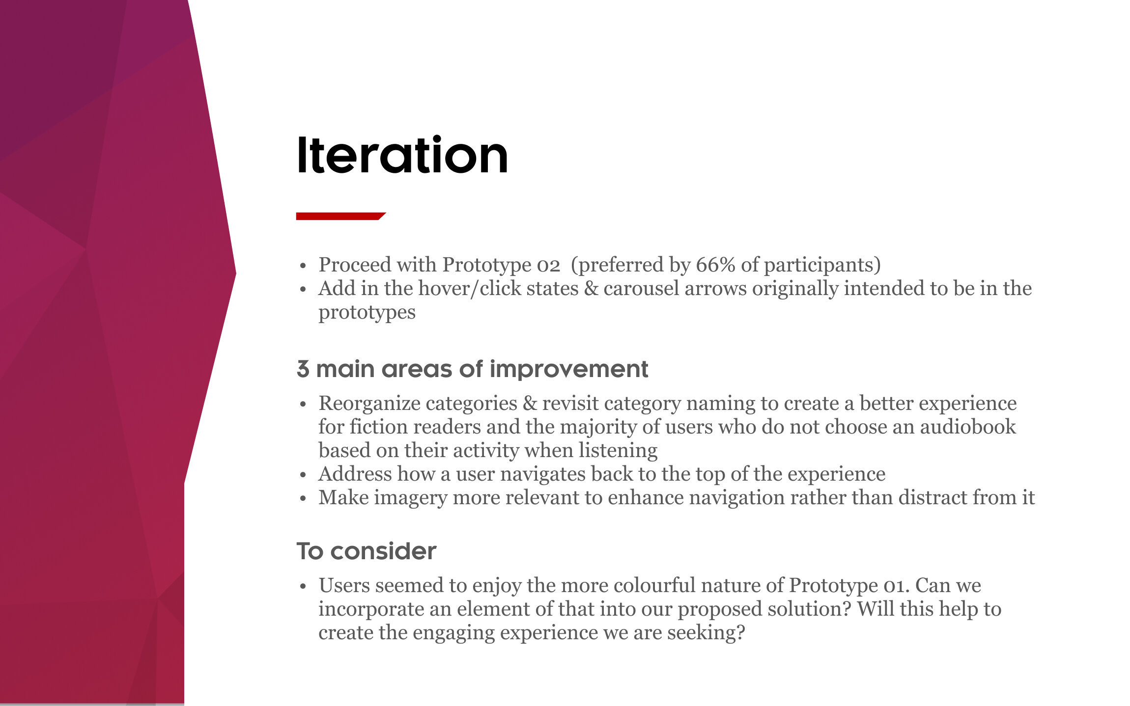
One of the most common flags we came across during user testing was the way the categories were organized and how this structure negatively impacted product usability. The Creative team had a working session with the content and strategy teams to add, delete and re-organize the lists into new buckets which would help inform updated copy.
Updated Design
Along with the copy recommendations, we suggested the following changes to the design to help enhance the navigation:
Use horizontal carousel-based navigation from Prototype 2 as our base
Move the back to top button to the bottom of the page as a text link instead of hovering red button
Remove the coloured overlays for accessibility, use coloured bars along the top of each content card instead as to not interfere with text and to bring in the solid colourful areas that were well received in Prototype 1
Replace previous thumbnails (subjects wearing headphones) with images directly related to the content
Updated design completed by Sam Arnold
Before and After
Through market research, user testing and iterative design, we were able to present solutions for the original hypothesized problems with this page as well as unforeseen insights gathered during the user testing process.
We addressed:
A too-long scroll which failed to engage (evidenced by heat map testing)
Inefficiently used space at the top of the page (header was too tall)
Categories & organization which did not resonate with audiobook listeners
Repetitive imagery unrelated to content
Generally out-of-date creative in reference to accessibility standards
Now that the page is live, a new heatmap has been created to analyze customer patterns, with the hope that the usability has improved, leading to higher conversion and interaction. Once we have those results, there is the potential to iterate further to reach an ideal user experience.


